ShopDreamUp AI ArtDreamUp

Deviation Actions


Suggested Deviants


Suggested Collections


You Might Like…


Featured in Groups


Description
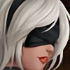
Again, more experimental art, going deeper into color techniques while trying to develop a more personal style.
Anyway i got inspired by this wallpaper [link] and this is the result. Although the armor/robe is not 100% as the image shows since i couldnt find a fullbody pic with good resolution to see the details of it, so i made a mix of some armors that pple send me to my journal and notes.
I think im aproaching to what i have in mind while doing this drawing, so my next personal work is going to be about dragons. I want to experiment more with beasts and creatures and see what im capable of doing.
Enjoy this piece of art. Much effort and experimientation where put into this (Smile)") .
.


Anyway i got inspired by this wallpaper [link] and this is the result. Although the armor/robe is not 100% as the image shows since i couldnt find a fullbody pic with good resolution to see the details of it, so i made a mix of some armors that pple send me to my journal and notes.
![[link]](https://www.deviantart.com/users/outgoing?http://hq-wallpapers.ru/wallpapers/4/hq-wallpapers_ru_games_15347_1440x900.jpg)
I think im aproaching to what i have in mind while doing this drawing, so my next personal work is going to be about dragons. I want to experiment more with beasts and creatures and see what im capable of doing.
Enjoy this piece of art. Much effort and experimientation where put into this
Image size
2480x3508px 3.57 MB
© 2012 - 2024 Felox08
Comments53
Join the community to add your comment. Already a deviant? Log In
First off, I'd say that I just adore the hair! Also, the shading of the muscles on her body was also fantastic; I can tell you've had a lot of practice with that. Her expression is fierce and deadly.. exactly how a sorceress should look like, righ?
The magic staff had this wonderful glow to it. I definitely loved the detail you put on the piece too.
Now for the ground. I got the impression that it's night.. she's standing somewhere high up, facing away from a castle, low-hanging mist obscuring the view of anything form there to the castle/tower. You did well on that, but it felt.. empty there. Like it'd just been filled in. I don't know how to describe it xD But the dragon was excellent! I wouldn't want to face that close up O^O
Armor. The top part looks AMAZING-- fabulous, realistic detail, also with great shading/light. What I didn't like so much was the leggings. They stuck out too much for me, maybe because of the brightness .. but the white stood out of the rest of the color scheme. Perhaps a darker blue would've been better? With gold outlining it instead of blue?
Just my opinion. Either way, you did excellent with this artwork. Looking forward to seeing more of your gallery, Felox! <img src="e.deviantart.net/emoticons/s/s…" width="15" height="15" alt="